February 04, 2006
[X-X-X-X]
Comments:
<< Home
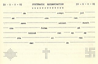
This is one of my favourite Federman "typography pieces".
In my MA thesis, I write that Federman’s unique use of typography points to the fact that he can neither escape nor completely evade his traumatic past as it haunts and manifests itself on the many different levels within the discourse. The most striking example in Take It or Leave It, I would argue, is this conceptual icon. Here, Federman’s shaped typography conveys the story of the erasure of his immediate family on an iconic, rather than a symbolic, level. This segment is, probably, the closest we get to the historical ‘truth’ in Federman’s discourse: the unspeakable “systematic extermination” of his family. Again, the four Xs (here literally introduced only within square brackets) signify the present absence of his obliterated family. The lack of any syntactical continuity and the many gaps between the scattered fragments of words convey a deeply moving visual image of Federman’s great loss. The inefficiency of language to ever express the void in Federman’s life is made apparent by the fact that the majority of the words are incomplete and presented to us as a combination of both English and French. Neither of Federman’s two languages apparently suffices as a means of speaking the unspeakable. This is a most conspicuous image that stays with the reader, remaining visible as an afterimage implanted in the reader’s mind long after the book has been read.
Post a Comment
In my MA thesis, I write that Federman’s unique use of typography points to the fact that he can neither escape nor completely evade his traumatic past as it haunts and manifests itself on the many different levels within the discourse. The most striking example in Take It or Leave It, I would argue, is this conceptual icon. Here, Federman’s shaped typography conveys the story of the erasure of his immediate family on an iconic, rather than a symbolic, level. This segment is, probably, the closest we get to the historical ‘truth’ in Federman’s discourse: the unspeakable “systematic extermination” of his family. Again, the four Xs (here literally introduced only within square brackets) signify the present absence of his obliterated family. The lack of any syntactical continuity and the many gaps between the scattered fragments of words convey a deeply moving visual image of Federman’s great loss. The inefficiency of language to ever express the void in Federman’s life is made apparent by the fact that the majority of the words are incomplete and presented to us as a combination of both English and French. Neither of Federman’s two languages apparently suffices as a means of speaking the unspeakable. This is a most conspicuous image that stays with the reader, remaining visible as an afterimage implanted in the reader’s mind long after the book has been read.
<< Home


